Animall - An Amazon for Cattle | UX Deconstruction
An online market place to buy and settle cattle online
In 2012, eBay India was the leading marketplace for buying and selling goods. It was a time when Amazon India did not exist. On Jan 12, 2012, I saw a listing for buffalo that gave 20 litres of milk daily on eBay. I instantly burst into laughter and shared the screenshot of it on Facebook. It was an instant hit and became only of my early viral posts, with most comments filled with jokes about the listing. eBay India removed the listing within a few hours post that.
Almost a decade later, India has an exclusive online marketplace to buy and sell cattle for farmers called Animall. It takes a contrarian approach to work on ideas like Animall.
Introduction
Animall aims to revolutionize the livestock industry by providing an online marketplace for farmers to buy and sell cattle. The app was conceptualised in Jul 2019 as part of an internal hackathon at Pratillipi and has now raised more than $36M in funding to make the dairy business profitable for the farmers.
In this edition, let’s uncover exciting design decisions crafted by the Animall team to address the usability challenge of emergent users.
Information Architecture
In addition to the marketplace, the app has a community and provides add-on services like cattle doctor consultation and price calculator.
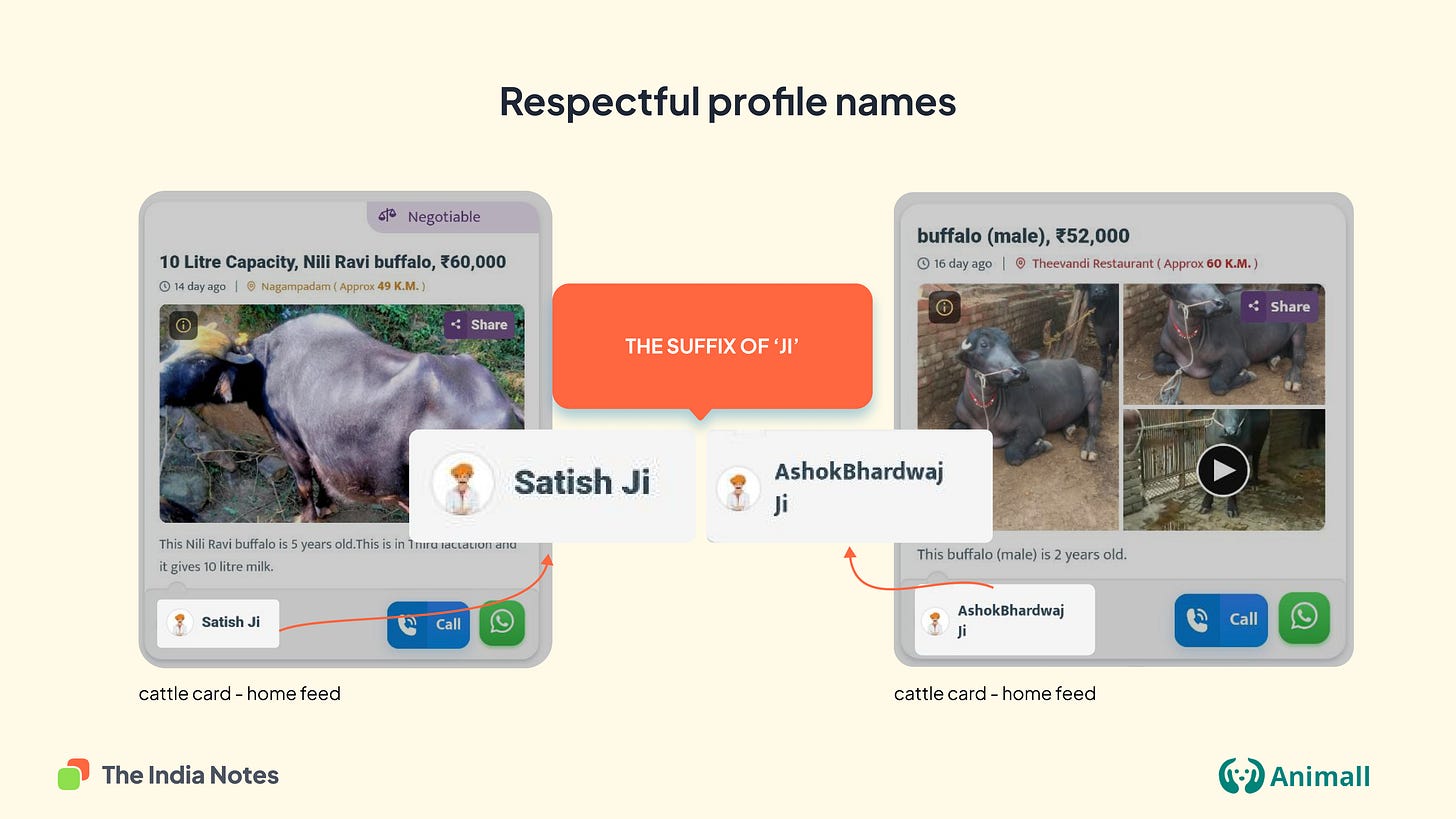
Respectful profile names
I became a fan of the content localisation inside the app. They are handcrafted with the cultural context. For example, their profile names have a suffix of 'ji', a common way to address people respectfully in Hindi-speaking regions.
Default WhatsApp CTA
The app takes a strong stance by making WhatsApp a default option to share the details of cattle among their friends. The call option seems to be the second preferred option for contacting the buyer.
A visual nudge to capture cow's image
Appropriate cattle images are crucial to attracting buyers to the app. Educating a novice tech user to click cattle images from various angles might be challenging. Clicking a good photograph involved lighting, focus, and distance from the cattle as essential parameters. The app visually shows a nudge for the seller to click the photograph through sample representation. The app also allows them to choose between a photograph and a video.
Enabling negotiation online:
In one of my recent user studies about food behaviour in urban households, a participant told me that his father does not purchase groceries online as the apps do not allow him to bargain. In contrast, he could do that while visiting the market. Negotiation and bargaining are one of these Indian business characteristics that are not being widely solved by Indian apps.
Animall highlights that certain cattle sellers are open to negotiation, and prices could be bought down through conversation.
Clubbing commerce and community:
Good content builds trust in people. Animall app enables farmers to browse and post information about cattle farming, thus creating an online community. The app also allows users to follow profiles, thus building a mini-social network of farmers.
Free pashu (cattle) consultation:
Animall provides free doctor video consultations for cattle. Each doctor is introduced through a pre-recorded video which makes it an exciting trust-building exercise.
Price calculator:
The app provides a price calculator to determine the estimated amount they might get for selling the cattle.
Some of the design decisions in the Animall app are a great start in our long journey of UI contextualization for emergent users. Which of the above features did you find interesting? Let me know your thoughts in the comments below. Also, suggest a few "Bharat" focussed apps to write about in our upcoming issues 🙂 Have a great day.
That’s all I had for today. Follow me on Twitter for more notes on Indian consumer behaviour.


Their loading screen has a GIF of a cow walking in pasture and it's one of my favourites :P
This is a lovely piece. Thanks Dharmesh