How are default choices designed in Indian apps?
Uncovering the effectiveness of defaults in product design.
Welcome 53 new subscribers 👯♀️.
For starters, I’m Dharmesh Ba, a behavioural researcher who explores Indian consumer behaviour in the digital space. This newsletter is my attempt to make actionable insights accessible to the startup community.
Current subscribers count: 1543 🥳
Choice architecture and defaults!
As digital product builders, we always make choices on behalf of the user.
Google search tells me which research I should focus on by laying out its search results in a certain way.
Swiggy tells me which restaurants could have better food through its ratings.
PhonePe tells me which bank account I should transfer money to by preselecting a bank account.
Some of the above tactics are nudges where the user is influenced to make confident choices, but some are defaults where the app has already chosen an option on the user's behalf (opt-out). If you have ever created an app where people made choices, consider yourself a choice architect.
For starters,
What is choice architecture?
Choice architecture is the study of how the design of choice environments influences the choices people make. A choice architect is a person who designs these choice environments. In a startup, the founders, designers and product managers are choice architects.
What are defaults?
A default is a pre-selected choice for people in a given situation. For example, the default choice in a given case may be the option that requires the least amount of effort to select. Defaults are often used in choice architecture to influence the choices people make.
For example.
Book My Show preselecting a donation amount on your behalf is an example of designing a default.
In this article, I will analyse the defaults designed checkout flow of the following apps.
Swiggy
Zomato
Book My Show.
Urban Company
IRCTC
Analysis Framework:
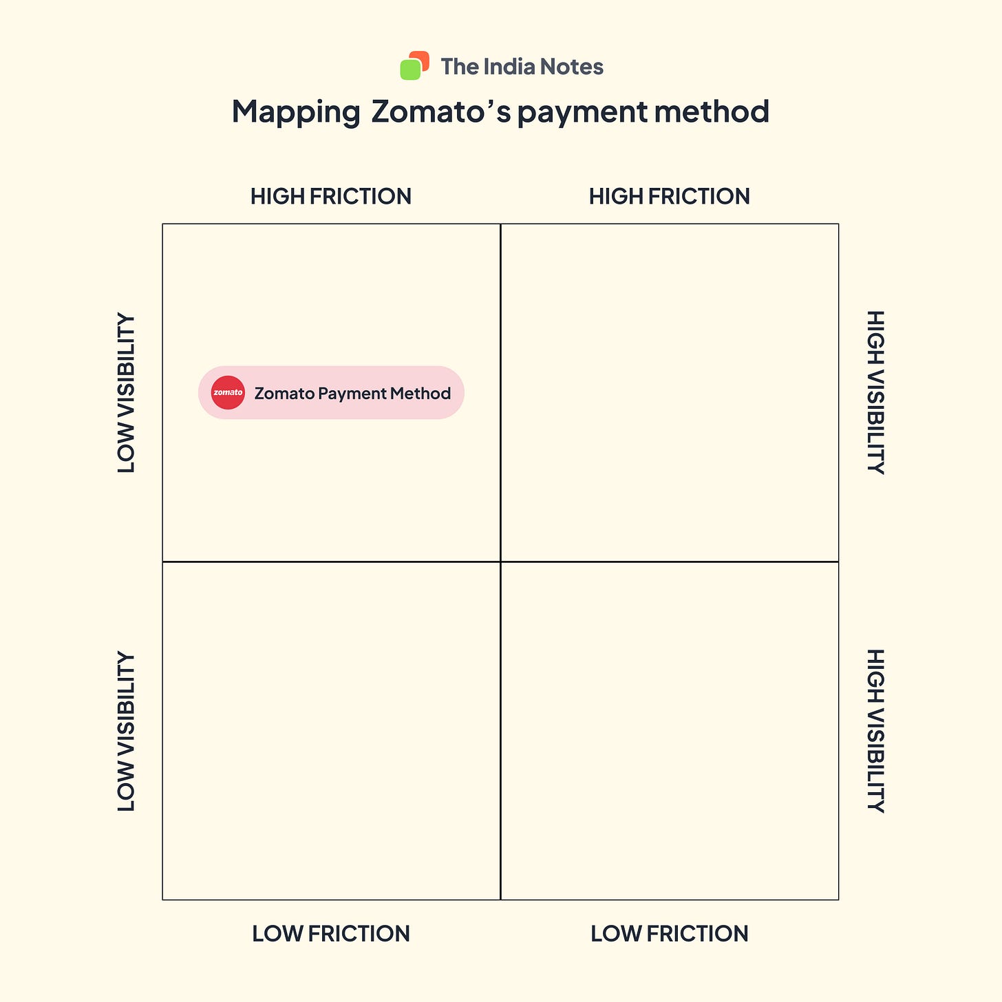
I will map the defaults based on their friction and visibility during the workflow.
High Friction is when the app makes it challenging to choose an alternative for the default choice selected, and low Friction is when the alternate choices are easy to choose from an array of options.
High visibility is when the app highlights the default choice in a clear, distinguishable manner in the design, and low visibility is when the default choices are subtle and hard to differentiate.
Friction and visibility affect people's choices differently. High Friction leads people to stick with the default choice more often, while high visibility leads people to switch to the alternative more often.
Zomato - Payment method selection
Food ordering is a frequent use case, and it only makes sense to preselect the payment method. Zomato picks up the last selected payment method and populates it. The challenge is that the default selection is clubbed with other elements like address selection, cutlery selection and pay now button. The clubbing of this different information makes the default selection less visible.
We are taken to the next screen to change the default. The additional step of choosing an alternative makes it high friction.
Swiggy - Payment method selection
On the contrary, Swiggy has an independent screen to select the payment method, which allows us to view the default selection based on previous preferences and choose an alternative without leaving the current screen. The default selection has high visibility and low friction in selecting an option.
IRCTC - Default travel insurance
On average, 11.44 lakh tickets are sold daily through the IRCTC mobile and web app, and the app provides travel insurance for Rs. 0.35 / person selected by default. The default insurance selection has a separate selection with an option to opt-out.
Zomato - Default donation selection
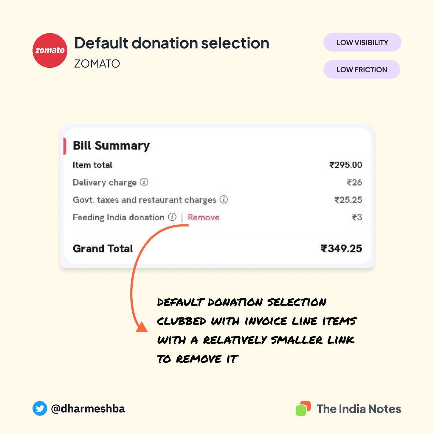
Zomato adds Rs.3 to its order by default which goes as a donation to the Feed India foundation run by Zomato. Unlike IRCTC, where there are two options for opt-in and opt-out, Zomato allows us to only remove the donation with a small link (not a button). The donation amount is clubbed with the invoice line, which makes it low visibility. The default falls under low friction, as it could easily be removed once discovered.
Zomato remembers the user’s choice and does not auto-select the donation once removed.
Book My Show - Default donation selection
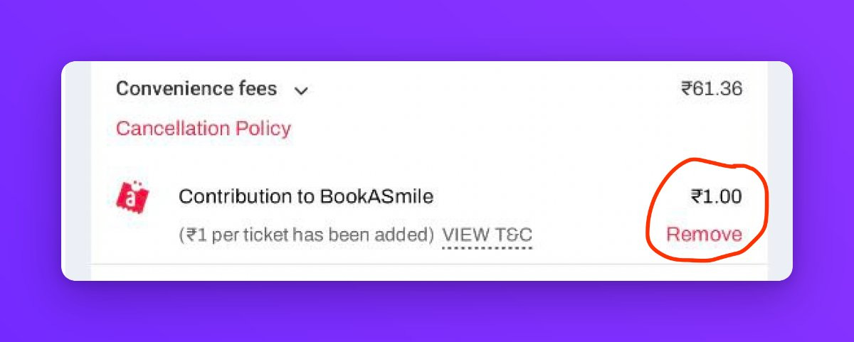
Book My Show adds its famous ‘Book my smile’ default donation of Rs. 1/ticket. Like Zomato, this default is also clubbed with the invoice line item, except it differentiates itself with an additional icon but the app does not remember the user’s choice and the donation demands to be manually removed every time while booking a movie ticket.
Urban Company - Default subscription added
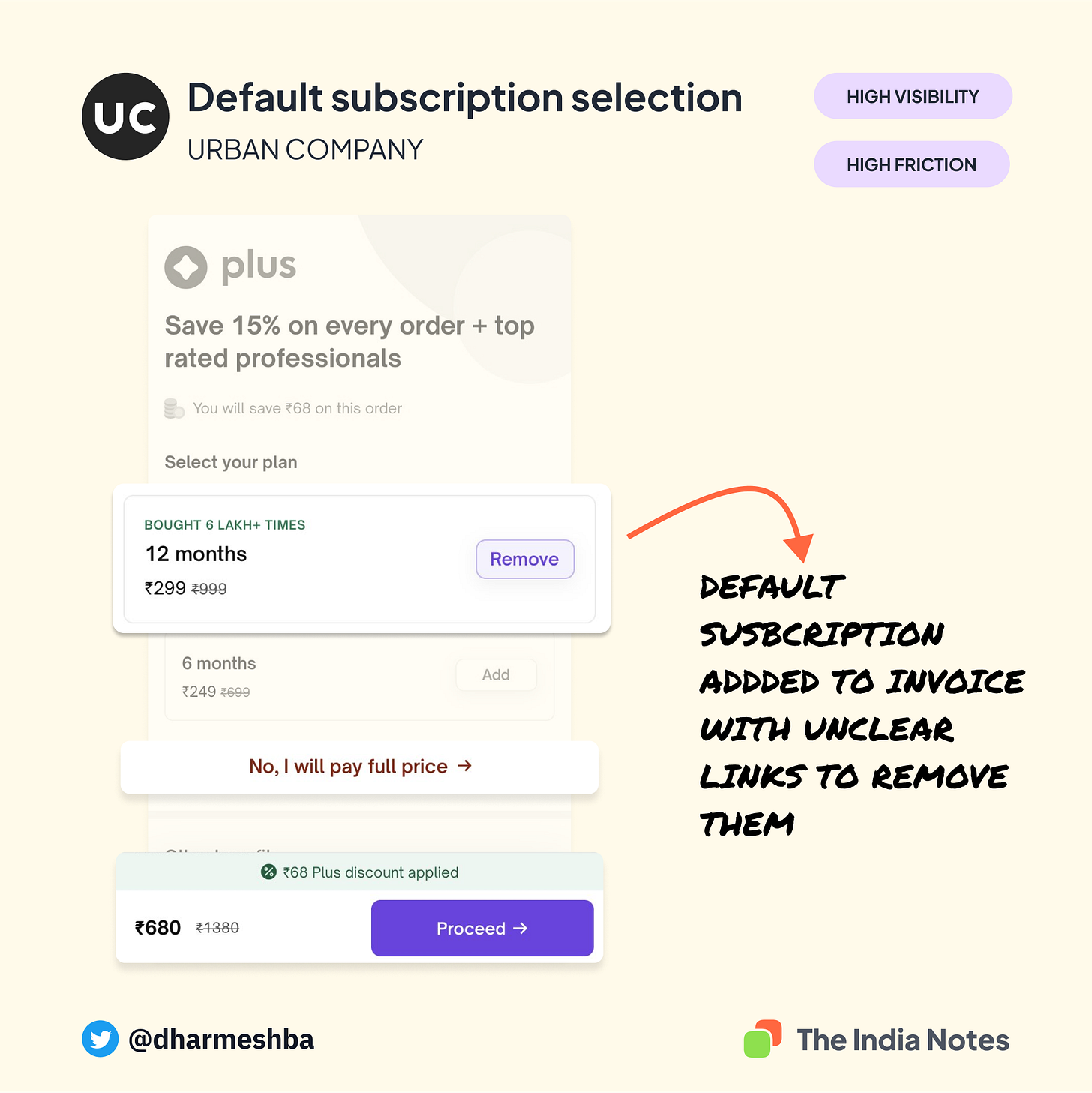
Urbancompany has a plus membership subscription, giving its users a flat 15% discount. The subscription is auto-added to the invoice during checkout, which could throw their users into a surprise. This default was suggested by Ramakrishna, who heads design at Zeta. It is interesting that the app takes the user to an independent screen where the invoice amount + subscription amount is shown.
But the friction to remove the default is high as multiple elements attract your attention. The nudge to continue the transaction with the default choice is higher than the cue to remove the default making it high visibility and high friction feature.
The final matrix
It’s challenging to decide which of these defaults is a good design. It depends on one thing - the context. For example, pre-selecting a payment method (ex., Zomato) during checkout could benefit a more extensive set of users compared auto adding subscriptions (like in an urban company).
The explanation of the default choice is also crucial. For example, the default donation added in Book My Show could have a genuine intent of helping people in need but making it an opt-out every time creates high friction. At times these could be perceived as dark patterns. I ran a poll on my Twitter to gather opinions on BMS's default donation. Almost 80% of the respondents were uncomfortable having the default opt-out every time.
Some participants commented that they wouldn't mind donating if there was an appropriate report on how the money was utilised.
Designing defaults need to have more nuanced discussion inside product teams as they have a second-order effect of trust building with users. I hope this piece initiates that discussion. The above mapping is my take on the designs. If you think certain features could have been mapped better, please share your opinions in the comments. I'm happy to be proven wrong and relearned.
Thanks to Rajesh Raghavan for sharing his ideas to frame my thoughts.
If you found this post helpful, feel free to buy me a c̶o̶f̶f̶e̶e̶ book through the link below. Psst, you could also recommend what I should read next :)


Great article Dharmesh :) :)
Hi, The Swiggy related annotation seems to be not there in the article. Am I missing something ?