FRND - A tinder for Bharat | UX Deconstruction
In India, we don't say, 'Do you want to go on for a date?' we say, 'Do you want to friendship?'
In India, we don't say, 'Do you want to go on for a date?' we say, 'Do you want to friendship?'. It's the most common slang used by boys to ask a girl to express interest in exploring a potential romantic relationship.
Dating culture isn't still prevalent in India. It's not uncommon for adults to opt for an arranged marriage. While tinder satisfies the western need to find a date, the Indian app FRND caters to the need to make friendships.
FRND dubs itself Tinder for Bharat. The app promises to connect with real people of the opposite gender within a safe and secure space.
The google play store page of the FRND app makes these promises:
Indian friendship app
Video/audio calls - Safe and private.
Verified Friends - Zero fake bots
Language Freedom - 14+ Indian languages
Virtual gifts to impress her.
100% Privacy - No real photos.
So how does the FRND app work:
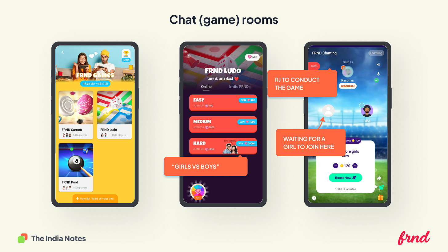
The app enables individuals to interact through curated chatrooms. But there is a catch. An RJ moderate each chatroom. RJs on the FRND app ensure the chatroom is safe, civil and engaging for the participant.
Here is a navigation map of the app
Why do I find this app interesting?
While the west influences most apps, FRND has built something that could potentially work for India from the ground up. Though the core idea of the app is similar to many Chinese live streaming apps, the nuances and design choices inside the app make it exciting.
During my tenure as a designer, I always dealt with stakeholders who would come up to me with reference screens from popular apps like Amazon, Flipkart, Swiggy, Uber, and Google. They insist that we build flows similar to the references shown as they are low risk. This is a pretty common scenario across the startup design teams.
In such an environment, it excites me when I find apps that take a stance and have a contrarian design.
Here is a mental map of the app
Onboarding and sign up
The app allows signup only via the mobile number (no email signups). The users need to identify their gender; the wrong gender would mean a life ban from the app. Users enter the app post selecting their language, and the app is customised based on the language they select, and once the language is selected cannot be changed later.
Terms and conditions:
You are asked to opt-in for an agreement where your misbehaviour* inside the app could lead to cybercrime action. Not sure if this checkbox is legally valid, but it's interesting.
*Misbehaving = abuse and harassment.
First aha moment:
You are instantly taken to the next screen post signup, where you are connected to a (random) woman over a voice call. This onboarding freaked me out, but I presume this would have been a delightful experience for the target audience.
Curated user rooms:
People curated based on their interests. You can initiate either a text, voice or video conversation. Chat conversations are free (one free random connection per day); audio and video chat initiations cost money (Roses). Roses are in-app FRND currency that you can purchase with real money.
Chat conversation:
I decided to try out a chat conversation. The app popped up a simple quiz to capture my interests, instantly connecting me to a person with whom I could initiate a chat.
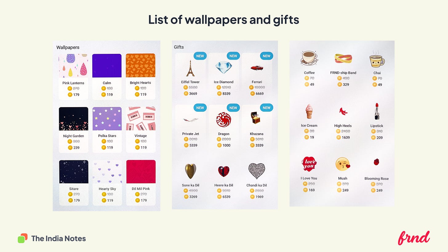
Inside the chat, you could send the other person virtual gifts or show them that they are special by purchasing custom wallpapers. Here is the list of wallpapers and gifts available inside the app.
Game chat rooms:
Chat rooms are where you can play games with others, or you could initiate a conversation moderated by an RJ.
Love Skool:
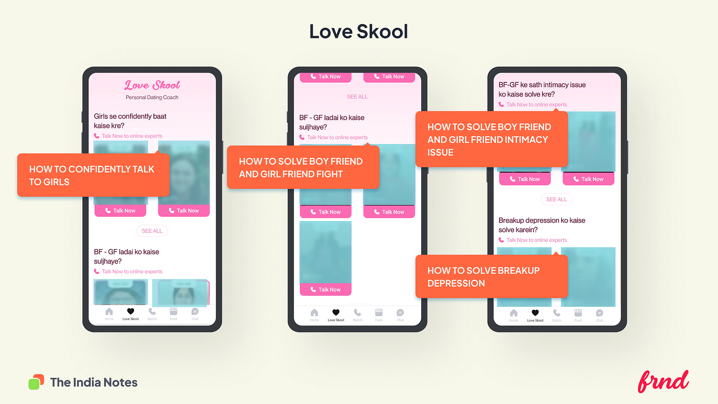
A place to seek advice from relationship gurus and therapists. This is the first time in the app that I see the profile pictures of the people. Otherwise, the app relies on avatars rather than real photographs to protect the identity of the people.
The FRND currency:
You could purchase coins to render services across the app.
Feed and chat:
The app also has a feed screen filled with images uploaded by women to showcase their profiles.
I find the design decisions in the app quite interesting, starting from the copy to the virtual gift curation. Only time will tell if these designs will make a business impact at scale and become a norm. Let me know your thoughts about this app.
I will be deconstructing the UX of more Bharat-focused apps. If you have a specific Bharat-focused app to deconstruct, send in your suggestion


Can you deconstruct the ELOELO app
Purana wala Frnd app achcha tha jisme rrcp tha impress me tha